
Blog
The role of colour matching trims in home design

Jun
TL;DR:
- Colour matching trims enhance room perception by visually expanding space and promoting cohesive design. They create a seamless flow in open-plan and smaller rooms, making architecture recede and furniture stand out. Selecting quality, thoughtfully finished trims in tonal harmony supports long-term elegance and perceived value.
Colour matching trims are defined as the practice of selecting flooring and architectural trim finishes that align closely with adjacent wall colours, creating a unified, uninterrupted visual flow throughout a room. The role of colour matching trims extends well beyond aesthetics. It shapes how large a room feels, how polished the finish appears, and how confidently the entire interior holds together. When trim and wall colours work in harmony, the result is a space that feels considered and complete rather than assembled from separate decisions.
How colour matching trims affect space perception and room flow
Matching trim to wall colour visually expands a room by 15 to 20 percent. That figure is not a minor cosmetic gain. In a small hallway or compact bedroom, removing the visual boundary between wall and skirting board can make the difference between a space that feels cramped and one that breathes.
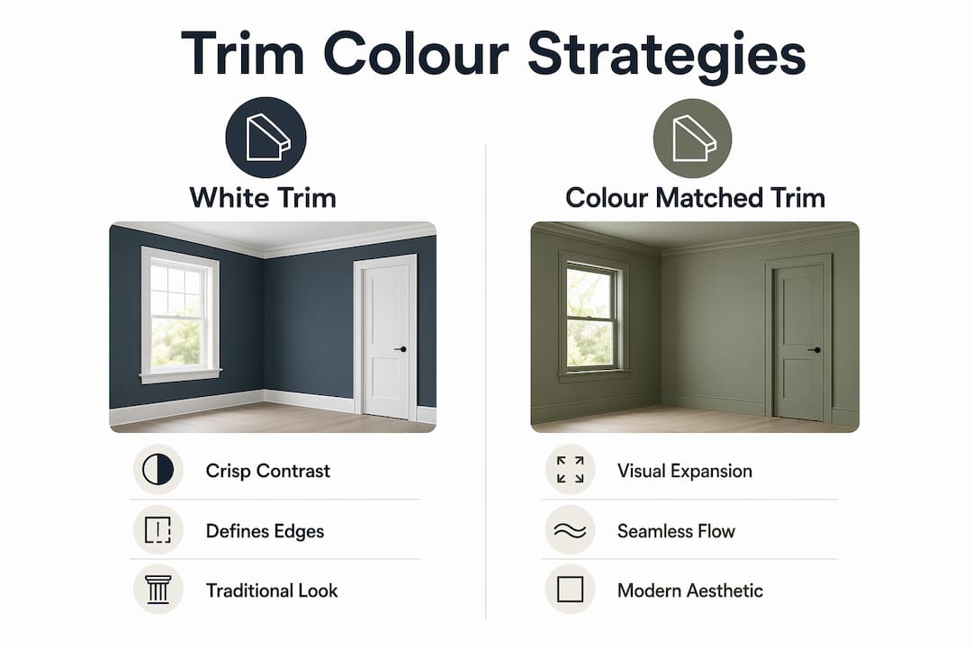
The mechanism is straightforward. When trim contrasts sharply with the wall, the eye registers each boundary as a separate element. The room is mentally divided into zones: wall, skirting, architrave, door frame. Each division interrupts the eye’s movement and makes the space feel smaller and more fragmented. Colour matched trims dissolve those divisions, allowing the eye to travel freely.
This matters most in open-plan layouts. Coordinated trims serve as a visual guide through connected spaces, preventing the choppy, disjointed appearance that occurs when each room treats its trim as an independent decision. In a home where the kitchen flows into a dining area and then into a living space, consistent trim colour acts as the thread that ties the whole composition together.
Key benefits of colour matched trims in open-plan and smaller rooms:
- Reduces visual interruptions that make rooms feel boxed in
- Creates a monochromatic effect that draws the eye upward and outward
- Guides movement through connected spaces without abrupt transitions
- Allows furniture and artwork to become the focal point rather than the architecture
The sheen of the trim finish adds a further layer of sophistication. Matte walls paired with semi-gloss trim in the same colour family deliver subtle depth without introducing contrast. The trim catches light differently from the wall, giving the room dimension without breaking the tonal unity. This is a technique used consistently in high-end residential projects and is far more refined than simply painting everything the same flat finish.
White trim vs colour matched trims: which suits your home?
The choice between traditional white trim and colour matched trim is not simply a matter of taste. It is a structural design decision that affects how architectural details read, how large the room feels, and how much the trim itself draws attention.

| Factor | White trim | Colour matched trim |
|---|---|---|
| Visual effect | Creates crisp contrast, defines edges | Softens transitions, expands perceived space |
| Best suited to | Period homes, high ceilings, bold wall colours | Modern interiors, smaller rooms, neutral palettes |
| Architectural detail | Highlights cornicing, skirting, and architraves | Allows architecture to recede, focuses on furnishings |
| Perceived quality | Classic and familiar | Considered and deliberate |
| Room size impact | Can make small rooms feel more enclosed | Visually enlarges rooms by reducing visual breaks |
White trim has genuine strengths. In a Georgian townhouse with deep cornicing and tall skirting boards, bright white trim celebrates the architecture. The contrast between a rich wall colour and crisp white trim is a classic pairing for good reason. It works because the architectural detail is worth drawing attention to.
The problem arises when white trim is applied by default rather than by design. Bright white trim can create jarring edges in modern or smaller homes, where the contrast draws attention to the boundaries of the room rather than its contents. In these settings, colour matched trims allow the architecture to recede and let the furniture, textiles, and lighting take centre stage.
There is also a practical argument for colour matching. Matching trim colour can camouflage simpler profiles, making less elaborate skirting boards and architraves appear more finished and intentional. White trim, by contrast, puts every profile detail under a spotlight. If the profile is modest, white trim will make that modesty obvious.
Pro Tip: If you are unsure which approach suits your home, paint a single door frame in your wall colour and live with it for a week. The answer will become clear far faster than any mood board exercise.
How to choose the right trim colour for your walls
Selecting the right trim colour is a process, not a single decision. Rushing it is the most common reason homeowners end up with a result that feels slightly off without being able to identify why.
-
Set your walls, textiles, and furniture first. Trim colour should be chosen last, once the dominant elements of the room are in place. Trim is a supporting player. Its job is to reinforce the overall composition, not to lead it.
-
Account for lighting at different times of day. A warm greige wall can read as pink in morning light and taupe by evening. Your trim colour needs to work across those shifts. Test samples on the actual trim surface, not on a piece of card propped against the wall.
-
Consider tone-on-tone rather than exact matching. Choosing a trim colour one or two shades deeper or lighter than the wall creates a layered effect with more visual interest than a flat match. This approach is particularly effective in rooms with limited natural light, where a perfectly matched trim can make the space feel slightly flat.
-
Use sheen variation to add dimension. Applying the same colour in a matte finish on walls and a semi-gloss finish on trim introduces a subtle luxury that prevents the room from looking one-dimensional. The trim catches light, the wall absorbs it, and the result is a room with genuine depth.
-
Test samples in the room, not the shop. Paint a section of skirting board and leave it for 48 hours. Observe it in natural daylight, artificial light, and at night. Colour perception shifts dramatically between a paint chip under fluorescent shop lighting and the same colour on your skirting board at dusk.
Pro Tip: When testing trim colours, apply the sample directly onto the trim surface rather than onto paper or card. The texture and porosity of the surface affect how the colour reads once dry.
The importance of colour matching in interior design lies in the relationship between elements rather than in any single choice. Trim acts as a connecting element between wall, floor, and ceiling. When that connection is deliberate, the room feels resolved. When it is accidental, the room feels assembled.
Common mistakes to avoid when colour matching trims
Even experienced decorators make predictable errors when it comes to trim colour. Knowing what they are saves considerable time and money.
-
Choosing trim colour too early. Selecting trim before walls, flooring, and furniture are confirmed is the single most common mistake. The trim colour that looked perfect against a paint chip can read entirely differently once the room’s dominant tones are established.
-
Relying on paint samples without in-room testing. Colour samples viewed in a shop or on a screen bear limited resemblance to the same colour on a skirting board in your specific room. Light, adjacent surfaces, and room proportions all alter perception significantly.
-
Ignoring trim profile. Trim profile affects perceived quality regardless of colour. A beautifully chosen colour on a thin, poorly finished trim will still look cheap. Conversely, a well-proportioned solid trim in a considered colour reads as a deliberate design choice.
-
Inconsistency across adjoining rooms. Inconsistent trim colours across rooms create a pieced-together appearance that undermines the sense of a coherent home. Consistency matters more than perfection in any single room.
-
Painting everything the same flat finish. Flat trim and flat walls in the same colour can look dull rather than refined. Sheen variation is what separates a considered colour matched scheme from a room that simply looks underfinished.
“Trim is the punctuation of a room. Get it right and the whole sentence reads clearly. Get it wrong and even the most beautiful words lose their meaning.” Crown Paints
The impact of trims on aesthetics is most visible when something goes wrong. A room with mismatched or inconsistent trim draws attention to the trim itself rather than to the space. That is precisely the opposite of what good trim colour coordination achieves.
Key takeaways
Colour matched trims work because they dissolve visual boundaries, expand perceived space, and allow the room’s furnishings and architecture to speak without interruption.
| Point | Details |
|---|---|
| Colour matching expands space | Matched trim and wall colour reduces visual breaks, expanding perceived room size by 15 to 20 percent. |
| Choose trim colour last | Set walls, textiles, and furniture before selecting trim to maintain overall design cohesion. |
| Sheen variation adds depth | Use matte walls with semi-gloss trim in the same colour family to introduce subtle dimension. |
| Consistency across rooms matters | Uniform trim colour throughout connected spaces prevents a disjointed, pieced-together appearance. |
| Profile quality affects the result | A well-proportioned, durable trim in a considered colour reads as a deliberate design choice. |
Why subtlety is the most underrated trim strategy
Most homeowners I speak with assume that trim colour is a minor finishing detail. They spend weeks deliberating over wall colours and days choosing flooring, then select trim in five minutes by defaulting to white. That decision, made almost without thought, often undoes much of the careful work that preceded it.
The misconception is that white trim is neutral. It is not. White trim is a strong design statement. It draws a hard line around every architectural element in the room. In the right setting, that line is exactly what the space needs. In the wrong setting, it fragments a room that could have felt cohesive and calm.
What I have seen repeatedly is that the most impressive interiors are rarely the ones with the most dramatic contrasts. They are the ones where every element supports every other element without any single detail demanding attention. Colour matched trims are central to that effect. When the skirting board, architrave, and door frame share the wall’s tonal family, the room settles. The eye moves through the space rather than bouncing between competing elements.
The other thing worth saying directly is that trim quality matters as much as trim colour. I have seen beautifully chosen colours applied to trims that bend, dent, or discolour within a year. The colour choice becomes irrelevant when the trim itself fails. Solid, well-finished trims in a considered colour are a long-term investment in how your home looks and feels. The colour coordination of trims and surfaces is only as good as the material underneath it.
— Matt
How Qualitycarpettrims can help you get the finish right
If you have spent time getting your wall colours and flooring right, your trims deserve the same level of thought and quality.
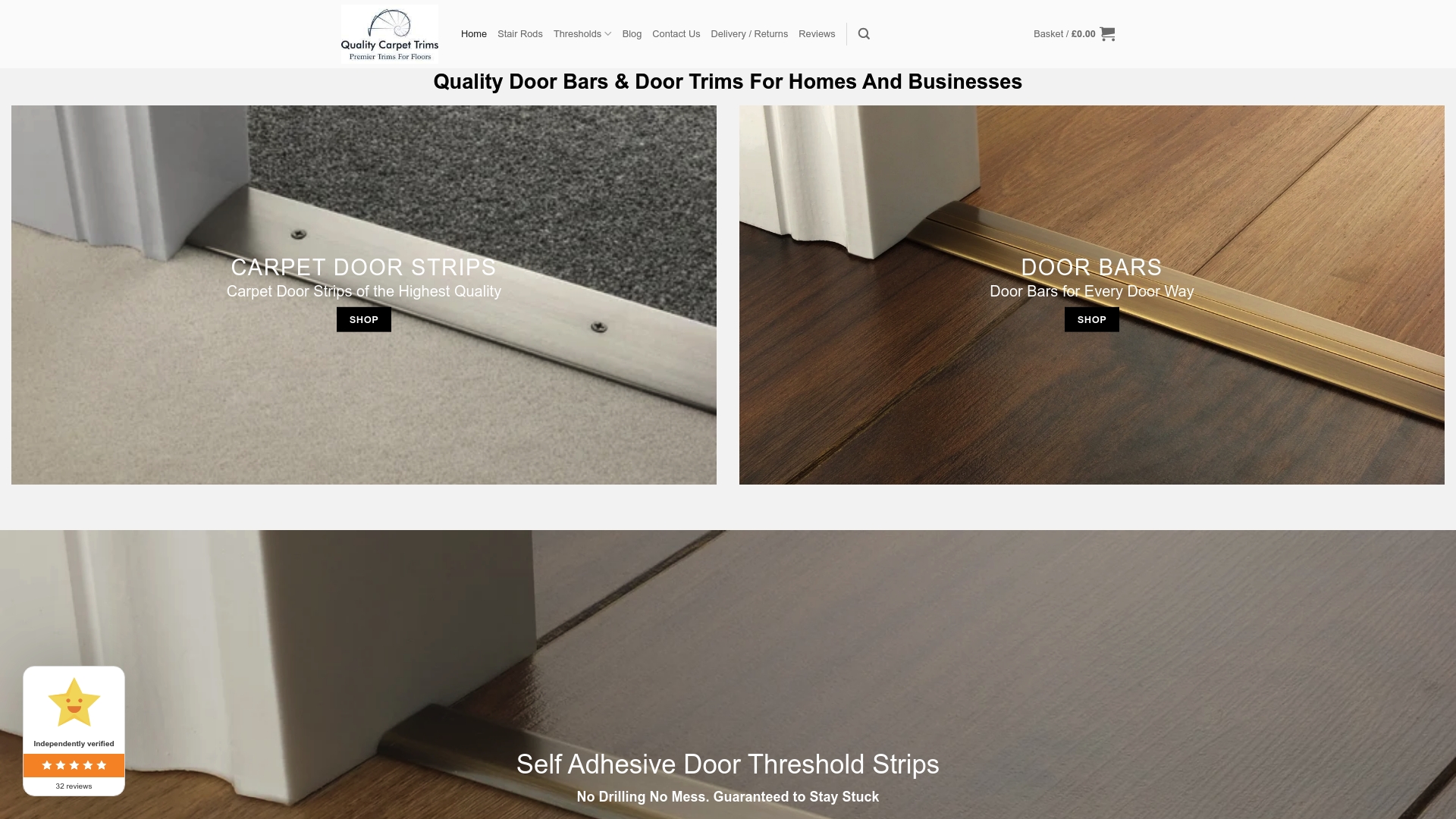
Qualitycarpettrims supplies solid brass door bars and flooring trims, hand-finished in 10 luxury colours designed to coordinate with the full range of interior palettes found in British homes. Unlike wooden, plastic, or aluminium trims that split, bend, or dent over time, solid brass trims hold their finish and their form. The powder-coated finishes are built to last, which means your colour coordination decision stays looking intentional for years rather than months. Browse the full range of colour matched trims and find the finish that completes your interior. Expert advice is available if you need guidance on which profile and finish suits your specific flooring transition.
FAQ
What is the role of colour matching trims in interior design?
Colour matching trims unify wall and architectural elements by reducing visual boundaries, which expands perceived room size and creates a cohesive, resolved interior. They act as a connecting element between walls, floors, and ceilings rather than a contrasting highlight.
When should I choose colour matched trims over white trim?
Colour matched trims suit modern interiors, smaller rooms, and open-plan layouts where visual continuity matters most. White trim works best in period homes with prominent architectural detailing where contrast celebrates the profile.
Does trim colour affect the perceived value of a home?
Yes. Custom colour matched trims can increase perceived home value by up to 15 percent by adding sophistication and a sense of intentional design compared to standard white trim.
How do I test trim colours before committing?
Apply the trim colour directly onto the actual skirting board or architrave surface and observe it across different lighting conditions over 48 hours. Colour perception shifts significantly between morning natural light and evening artificial light.
Does trim profile matter as much as trim colour?
Trim profile affects perceived quality independently of colour. A well-proportioned, solid trim in a considered colour reads as a deliberate design choice, while a thin or poorly finished trim will look cheap regardless of how carefully the colour was selected.
Recommended
- The role of trims in home decor: a guide for UK homes
- Why match trim finishes for cohesive interiors
- Why trims enhance decor: a homeowner’s guide
- How trims transform decor for safer, stylish spaces